Faculty/Staff Data Viz Gallery
Faculty/Staff Data Viz Gallery
2024 Faculty/Staff Data Viz Champion
Author: Laura Guertin, Penn State University
Blue Skies and Cloud Cover
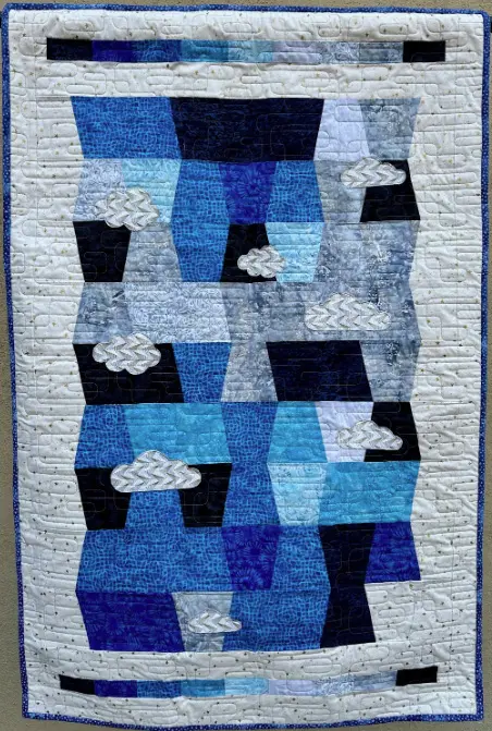
Description: In 2022, I sailed for two months on the oceanographic research vessel JOIDES Resolution. While at sea, a Daily Operations Report (DOR) is published each day to update the scientists and crew with data recorded during the previous day. The JOIDES Resolution not only record data from the ocean floor but also meteorological measurements from the atmosphere. These data include the visual observations made by the 2nd mate on the Bridge of sky/cloud cover. Cloud cover is the fraction of the sky covered by cloud of any type or height above the ground. It is measured on a scale that starts at zero for a clear sky and extends to eight for a sky that is completely overcast. A value of one means that 1/8 of the sky is covered in clouds, a value of 2 means that 2/8 (or ¼) of the sky is covered in clouds, and so on. The units used to report sky cover is okta. I took the daily sky measurements and generated a quilt to represent these daily data recorded. Each batik fabric on the scale across the top and bottom of the quilt represents an okta value, zero/dark blue on the left side, and across to eight/black on the right side. Each tumbler (or trapezoid) is for each day of my time at sea (Expedition 390, April 7 through June 7, 2022). The clouds are placed over some of the days with the most cloud cover and are made of fabric manufactured in South Africa, the country the ship departed/returned to.
Ohio State News Traffic
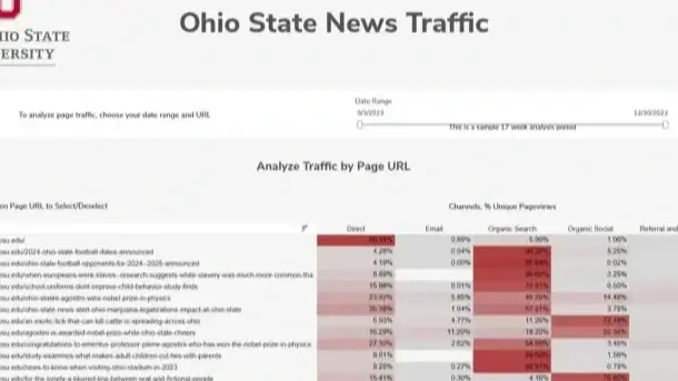
Description: The Ohio State News Traffic dashboard displays critical findings into campaigns - including traffic sources, user behavior, and device information. These insights help in understanding the effectiveness of various campaigns, optimizing strategies, and making data-driven decisions.
Authors: Tanya Zyabkina & Ryan Sosnowski, University Marketing & Communications
Why are Indiana Residents not Paying For Home Internet?
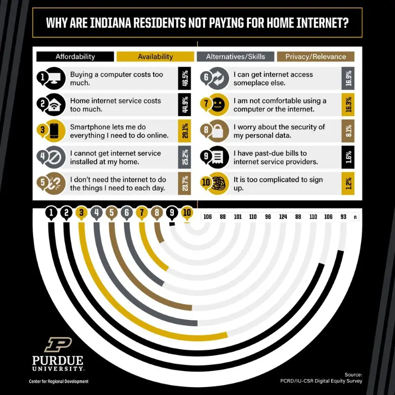
Description: Like other states and territories, Indiana is in the middle of a digital equity planning process. This plan is required for the state to access future capacity-building digital equity funds that are part of the Infrastructure Investment and Jobs Act or IIJA, passed in November of 2021, intended to address barriers to digital equity. The Purdue Center for Regional Development (PCRD) within the Purdue University Office of Engagement, in partnership with the Indiana Broadband Office (IBO) and the Indiana Office of Community and Rural Affairs (OCRA), is working on writing the state's first-ever digital equity plan. As part of this effort, PCRD partnered with the Indiana University Center for Survey Research (IU-CSR) to gather data on Indiana residents on several digital equity indicators. One key indicator of digital equity—and the focus of this visualization—is who's not paying for a home internet subscription and why they are opting out.
Author: Ryan Maluchnik, Purdue University
Underrepresented Report Dashboard
Description: A collection of dashboards that visualize the data reported in the University of Illinois System’s Underrepresented Report (which is published annually). It contains a comprehensive profile of the participation and success of University of Illinois students, faculty, and staff by Racial/Ethnic Group, Gender, and Disability. It also contains a Peer Comparison Dashboard which allows for interactive comparison of Underrepresented metrics across different peer groups.
Authors: Nick O’Dea, Chris Lehman, Sally Mikel, Pam Lowrey, Kris Smith, Nate Wilds, Siew Szetho - University of Illinois
Planet Blue: U-M Progress Toward Climate Action and Sustainability
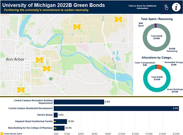
Description: This collection of dashboards tracks the University of Michigan and its efforts to reduce environmental impact via metrics related to energy & emissions, transportation, waste production, and land & water usage.
Author: Christopher Gardner, Business Intelligence Analyst Lead, Information and Technology Services - University of Michigan
CLAS Tableau Dashboard Usage Statistics
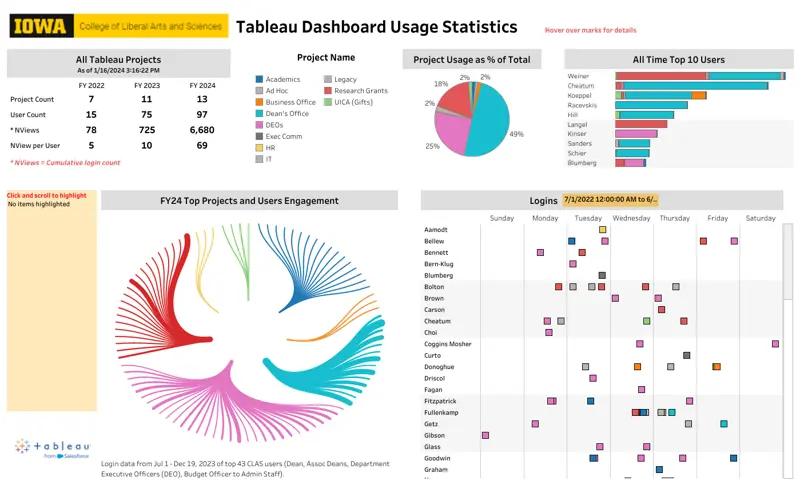
Author: Meliza Wise - University of Iowa
Nebraska Early Childhood Funding Map
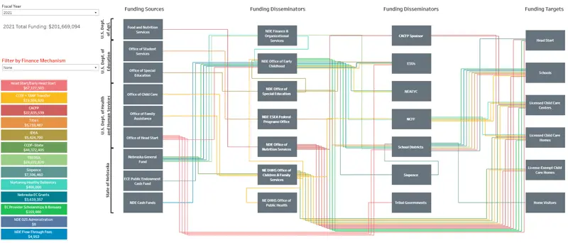
Description: Buffett Early Childhood Institute’s (BECI) understanding Nebraska’s public investment in early childhood care and education (ECCE) is central to their ability to make informed decisions about funding and how those dollars translate into quality ECCE. The creation of custom algorithms within Tableau Prep and Tableau were used to create an interactive tool designed to help BECI users visualize the current complexity involved in public-sector financing of Nebraska’s ECCE system while also exploring individual pathways within it. Equally as interesting as the viz itself is the ability for the custom algorithms to adjust to input and update different workflows for years to come. Rather than hard coding a single workflow these algorithms allow for new paths, spacing, and layouts with truly little adjustment. Not only did this workflow report meet the needs of BECI but also opened the door to many other workflows if the need were to arise.
Authors: Michael Stevens, Senior Researcher - University of Nebraska-Lincoln
Beyond the Plate: The Wider Impact of Antibiotic Use in Salmon Farming
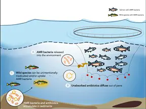
Description: Of farmed fish species, salmonoids represent the highest production growth in the global market. To meet the demand for these stocks, farmers are increasingly dependent on the application of antibiotics to produce a commercially profitable output of a fit-for-consumption product. The often unregulated and unmonitored application of antibiotics on farmed salmon has led to an explosion in antibiotic resistance in farmed fish. Raised in semi-natural habitats, resistant bacteria and excess antibiotics escape into globally connected waterways, impacting non-target species.
Author: Dr. Chloe Fouilloux - University of Wisconsin-Madison
Terpene emissions from Ponderosa Pine needles in 2021, illustrated through abstract paintings
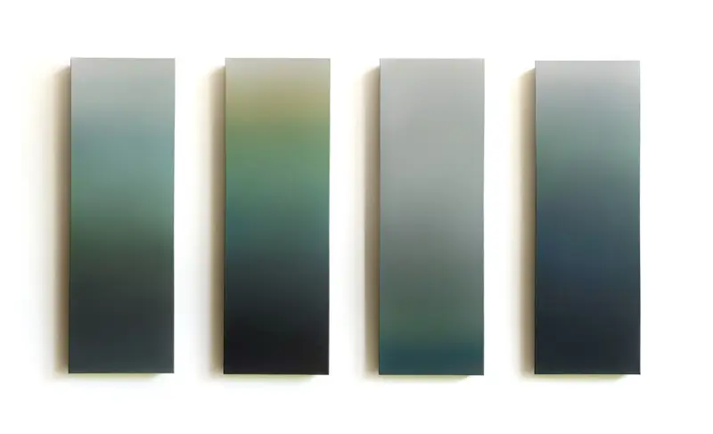
Description: I am a staff member at the UMN, but I am also an artist. In 2020-2022, I was invited to participate in a collaborative NSF research project with Dr. Dylan Millet's lab in Atmospheric Chemistry in order to fulfill NSF's Broader Impacts section. Through animating data gathered during their research through paintings, I helped share their findings with the broader community.
The 'Leaf Portrait' paintings correspond to the unique signature of monoterpene gases that Ponderosa pine needles emitted during photosynthesis, as studied in 2020-21 by Dr. Mj Riches (Colorado State University) during the NSF collaborative project with the Millet lab (UMN).
Each of the 27 Leaf Portrait paintings began by replicating a column from the chart of leaf data that Dr. Riches generated, which shows emissions of four types of monoterpene gases. Through the process of layering thin layers of paint with brushes, my own reverence of the forest itself shows through the blurring of this factual info. Like a fractal whose pattern replicates at various scales, these representations not only show the atmospheric fingerprint of each needle but also capture the vast wonder and variability within the forest ecosystem as a whole – as a broader impression of landscape.
Authors: Lindsy Halleckson and Dylan Millet - University of Minnesota and Mj Riches - Colorado State University
SustainableUMD Progress Hub
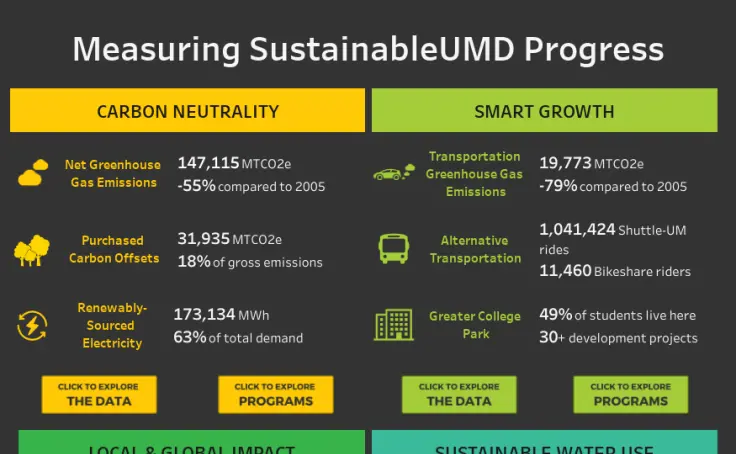
Description:
The SustainableUMD Progress Hub offers interactive data dashboards and stories to report on the University of Maryland, College Park's progress towards integrating sustainability into campus operations, research, and academics. The collection includes seven public Tableau dashboards containing over 130 graphs, 30 view filters, and data from more than 35 units across campus. The dashboards report on sustainability topics including carbon neutrality, energy and water consumption, transportation, green buildings, land management, education for sustainability, green procurement, waste minimization, and many other topics.
Author: Emily Hightower - University of Maryland
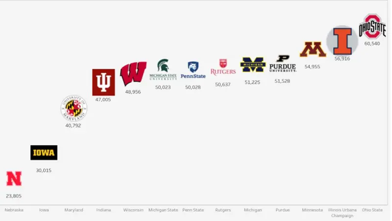
CDS and IPEDS Data for Peer Comparison
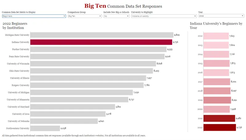
Description: This tableau allows comparison of CDS and IPEDS metrics between IUB official peers, Big10 schools, and Indiana public institutions over time. Different peer groups can be selected, as well as which university to highlight.
Authors: Sasha Haywood - Indiana University
MI Spartan Impact
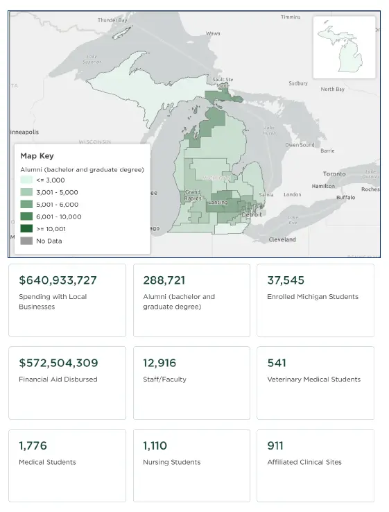
Description: MI Spartan Impact provides geospatial views of MSU community impact across regions of the state. Views include student enrollment, alumni, financial aid dollars disbursed, degrees granted, economic impact, spending with local business, and more.
Authors: Jeremy Reuter and Joel Lenz - Michigan State University
Staff Contact
Lori Frost
Program Manager
Programs Team
Phone: (217) 333-9228
Email: lori.frost@btaa.org
Institutional Coordinators
Illinois – Amy Edwards (aledward@illinois.edu)
Indiana – Bridgett Milner (bharsh@indiana.edu)
Iowa– Matthew Anson (matthew-anson@uiowa.edu)
Maryland – Michelle Appel (mappel@umd.edu)
Michigan – Tracy Pattok (tpattok@umich.edu)
Michigan State – Bethan Cantwell (cantwelb@msu.edu)
Minnesota – Colin Delong (delo0041@umn.edu)
Nebraska – Jason Casey (jcasey10@unl.edu)
Northwestern - Debbie Crimmins (d-crimmins@northwestern.edu)
Ohio State – Maureen Henry (henry.371@osu.edu)
Penn State – Paulina Krys (pmk5516@psu.edu)
Purdue – Andrea Pluckebaum (apluckeb@purdue.edu)
Wisconsin– Beth Helmueller-Perkins (helmuellerpe@wisc.edu)